Let’s talk a little bit about commas.
Commas are the litmus test of production editing. In fact, you could develop a whole flow chart of suitable careers in the editorial field based purely on commas.*
There’s a lot of functionality and style about commas. They say a lot. They say whether what you’re reading is a book or an article. They say whether you hired a proofreader or you didn’t. They say pause, breathe, read this together, read this apart, hold me, remember me, you’re almost at the good part, and phew, here’s the denouement. They’re the ants of the written world: absolutely essential little critters that cause chaos when they’re not around and provide disgust and distaste when they swarm. I love commas!
They’re tricky things, and in the Treasure Hunt of Superiority that is copyediting, commas are the X. (If you think commas are “nitpicky,” as someone at work mentioned, you are in the wrong field.)
Yesterday’s Adventures with Commas
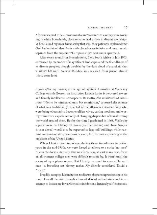
Now, I’d like you to take a look at an average, run-of-the-mill page of manuscript I was reviewing. Go ahead, enjoy.
Commas are supposed to take the same formatting as the word they’re attached to. For example, if the word is italic, the comma is italic. If the word is in boldface, the comma is in boldface. N’est-ce pas? Bon.
I was so pleased with myself when I spied that comma after just such a little italic introduction after the text break above, only on page 78. “Oh ho!” I said, “the copyeditor missed one!”
But of course, I then started paying close attention. I flipped back to page 1 and started looking again.
“GOSH!” I said after thirty pages. “I need to mention this issue to the copyeditor!” Scritch scritch scritch went my pencil.
I got to about page 130 when I said, out loud, “This is ridiculous.” I then looked back and looked very closely at the commas. I put my water glass on top of the page to try and magnify it. I borrowed someone’s reading glasses. I finally brought up the PDF on the screen and blew it up to 150, 200, 400 percent.
At 800%, I saw this:
These are both commas from the same typeface, taken from the above-pictured page. The top is the italic comma, the bottom is the normal (referred to as Roman) comma. Most of the time, the tail of italic commas swing under the head on a lovely italic incline. But sometimes, evidently, the italic comma remains as vertical as its Roman counterpart like a bobbing typographic sea horse.
“Darn it!” I said, not least because this meant my sharp eyes had not been so triumphant in the game of Proofreading Powerball as tricked in the game of Proofreading Punk’d.
So then I had to go back to page 1 to check all the commas I had marked with a little line underneath them and a circled “ital” in the margin and double-check to make sure each one had that tiny bit of undercurve swoop that turned the comma from tadpole into a lady-frog’s tongue.
And then I had to white out all my little “ital”s in their circles, and my white out ran out.
And there was no more in the entire office.
Which meant (probably after about an hour and a half of straight-up marking commas) I had to go back through with another color and cross out each and every little bubble of triumph. Even then, I peered at every italic word and the punctuation that followed it.
I might have taken that moment to go make a mug of cocoa. With two packets. But I can’t remember clearly; it was a bit of a blur.
Thankfully a new order for correction tape was placed promptly, but for now I have to be very, very careful. Those little commas will stick like thorns in your flesh if you’re not careful.


🙂 Thank you for sharing your experience so colorfully and “comma”-ly.
Hahaha very nicely done! 😛
Bonus points for the dashing flowchart!
Thank you! It was inside me screaming to get out. That flowchart landed me twelve mintes late to a sixteen minute meeting. Oops. Can I claim labor pains?
Yes, Noël, you may ALWAYS claim labor pains.
Why yes, I do, in fact, have strong feelings about the Oxford comma. I LOVE the flowchart. 🙂 And the entire post, for that matter. You must have one of the best jobs EVER.
*I* certainly think so!